 Fern
Fern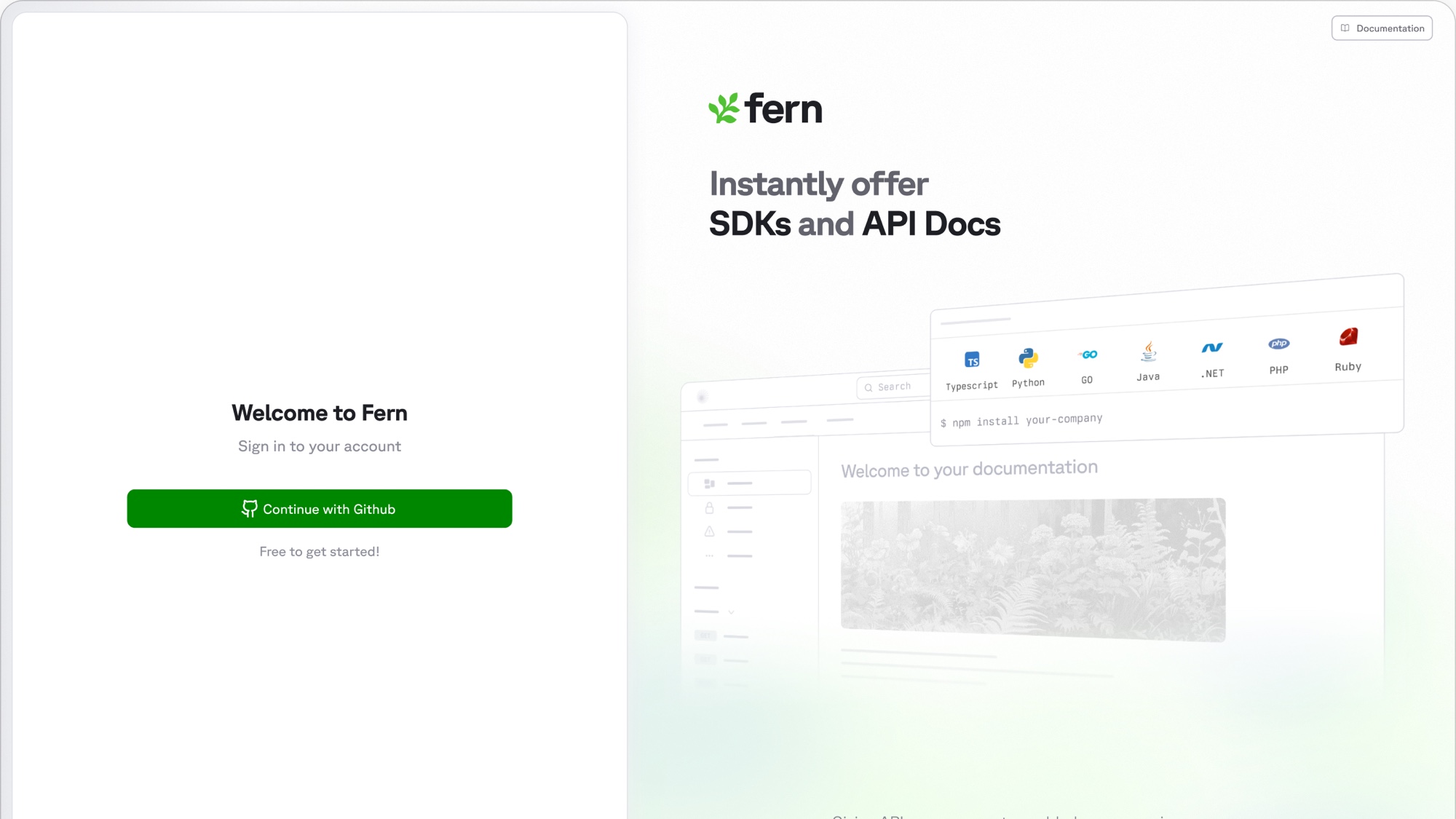
I designed and built Fern's first dashboard from scratch. It launched in November 2025, and 11,700+ people have taken 355,000+ actions in it since. Here are the design decisions that made it feel like Fern.
TL;DR Fern ran entirely through a CLI and config files. That was right for CI pipelines but wrong for humans. For example, generating a team member to the Fern org meant messaging our support team. I designed every screen of the dashboard and shipped a share of the code myself. As a result, our monthly active users grew 6x in the three months after launch.
Before the dashboard
Fern turns API definitions into SDKs and Docs sites. For years the whole product was a CLI and a fern/ folder in your repo. For the core workflow that model was fine: SDK generation belongs in CI, Docs deploys belong in a pull request, and configuration belongs in Git version control where it can be reviewed.
But it broke the moment a task was not a pipeline. Generating an API key. Inviting a teammate. Pointing a Docs site at a custom domain. Some of these don't need a YAML edit, but YAML was the only interface we had, so customers did the reasonable thing: they asked our team to do it for them. Every one of those requests was a small tax on them and on us.
Our goal was simple, give everyone who touches Fern a visual home (engineers and docs writers alike). In addition, ensure it matches the polish of the docs sites that Fern renders for them. Salo Serfati at Chariot said it best on launch day:
Nice! No more having to edit docs through code editor
The system
Two major themes carried throughout the design: calm. It is the same principle that later shaped our marketing site rebuild.
Calm shows up as restraints in 3 main forms:
- The information architecture.
- The simplicity of copy.
- The speed to action.
The sidebar is a perfect example: we only surface the bare minimum of nav items to the user. Each nav item has a delightful custom crafted animation on hover. These philosophies extended to the dashboard.
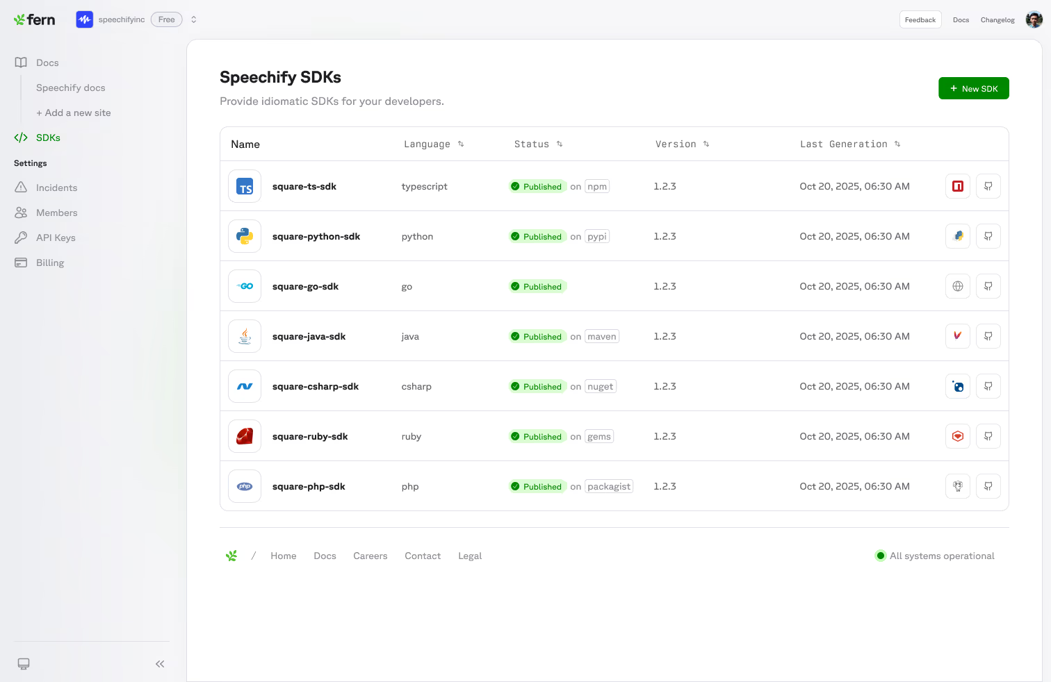
I designed the system in Figma and then worked daily with the engineer who built the first scaffolding: Zach Kirsh. I also shipped polish in code where owning the last detail mattered, like the subtle animation on each nav item. Designers who commit get to keep the nuance that usually dies in handoff.
The front door
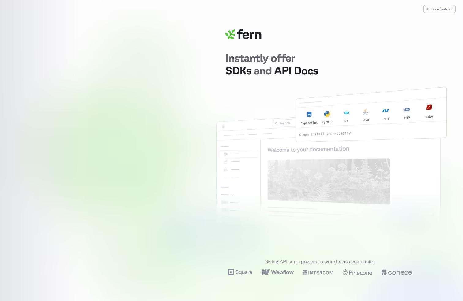
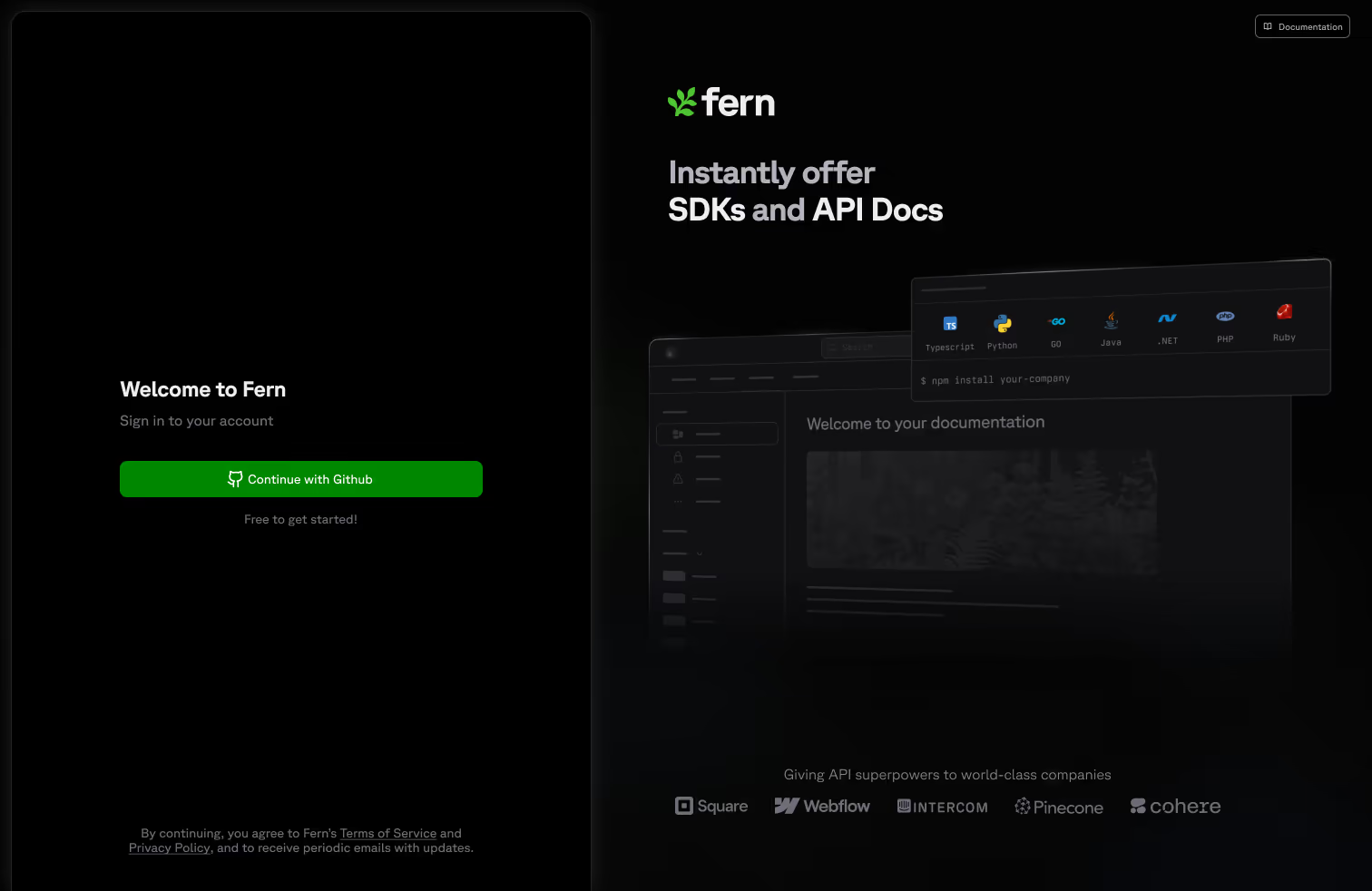
The welcome screen sets the product itself adrift. A card of SDK languages hovers over a faded Docs site on a field of soft gradient and animated noise. The products introduce themselves quietly and have a subtle approach on hover.
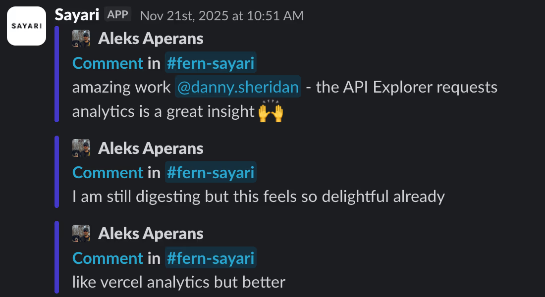
Aleks Aperans at Sayari, on launch day:
I am still digesting but this feels so delightful already
Onboarding
I wanted an onboarding that surfaced the core value to our users in less than 5 minutes.
The first version kept the ask small. Configure your docs site in the simplest form I could draw: a site title and a bit of branding, nothing else. The bet was that the fastest way to earn trust was to ask for almost nothing and still hand back something real.
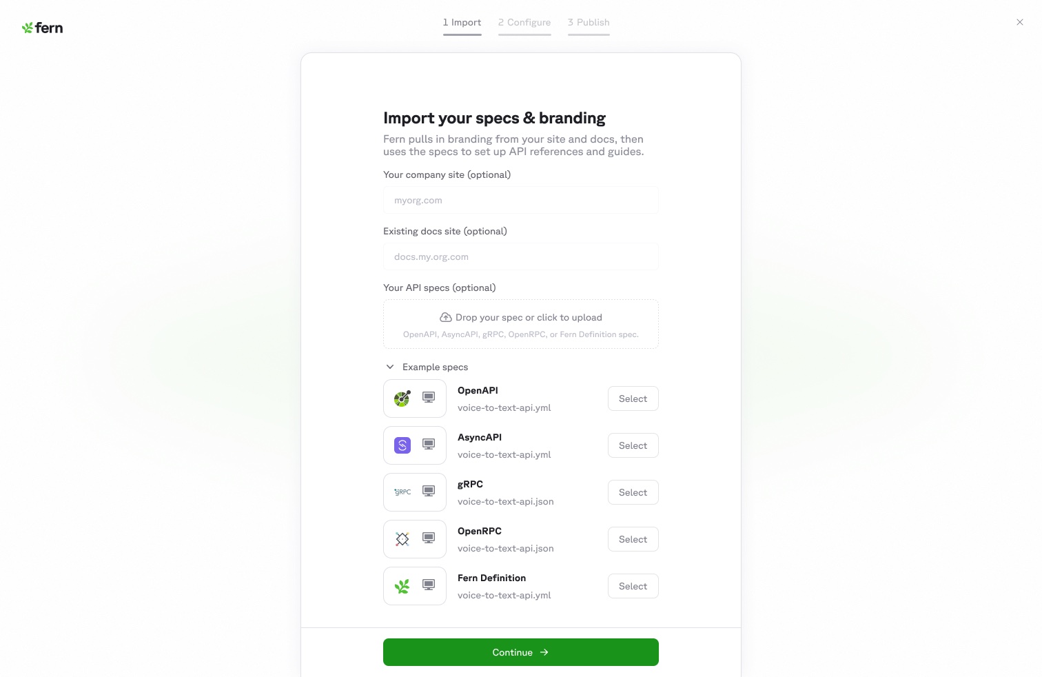
The second version was led by Mathieu Legault, we wanted to get closer to a more beautiful feature-rich docs site.
To do this we improved our docs publishing engin and then we made the configuration realistic instead of minimal: pull branding straight from a company's marketing site, offer real themes and layouts, and, most importantly, show a live preview of the actual docs site in an iframe on the right. You change a color on the left and watch your own docs change on the right. The setup stops feeling like a form and starts feeling like you are already using the product.
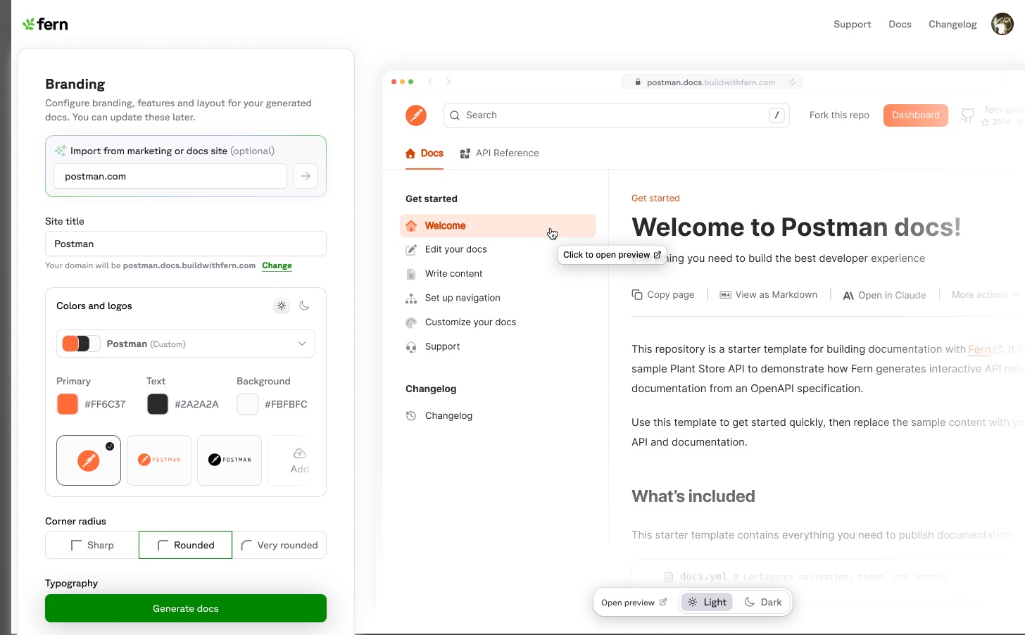
Mathieu knocked it out of the park with beautiful micro-interactions and animations. Outside of Mathieu, we had engineering contributions from Sarah Bawabe, Shraddha Shetty, and Tristan Declarin all shaped the version that shipped.
Floating panels
My atomic structure for the dashboard were floating panels with rounded edges. The goal was that these panels would slide around to fit the content that was important.
Everything in Fern nests. An org holds docs sites, a docs site holds settings, a setting holds a form. The standard answers are to navigate away, which loses your place, or to open a modal, which hides the context you need to fill it in.
Instead the floating panels slide from edges of the screen and the page you were on stays put underneath. Close a tray and you are exactly where you left off. You never lose the room you are standing in.
Core functionality first
When starting from scratch, our gut reaction is to build every feature from our CLI and platform. Instead I designed all of the surface areas and we chose the top 3 flows that customers had been nagging us about:
- Adding team members
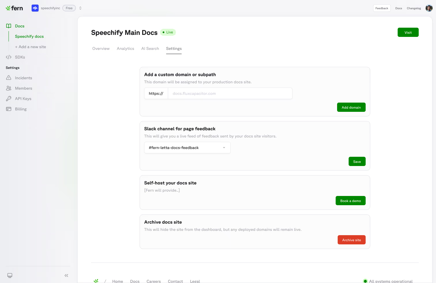
- Setting up custom domain
- View Docs analytics
We built the shell first and then shipped these 3 features within a 2 months. Then we continued to tack on more features as agentic workflows became more popular. Now, everyone on the Fern team has contributed to the dashboard in some format.
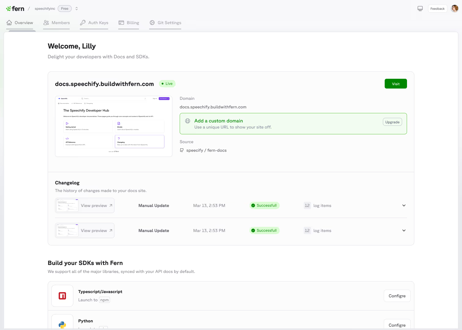
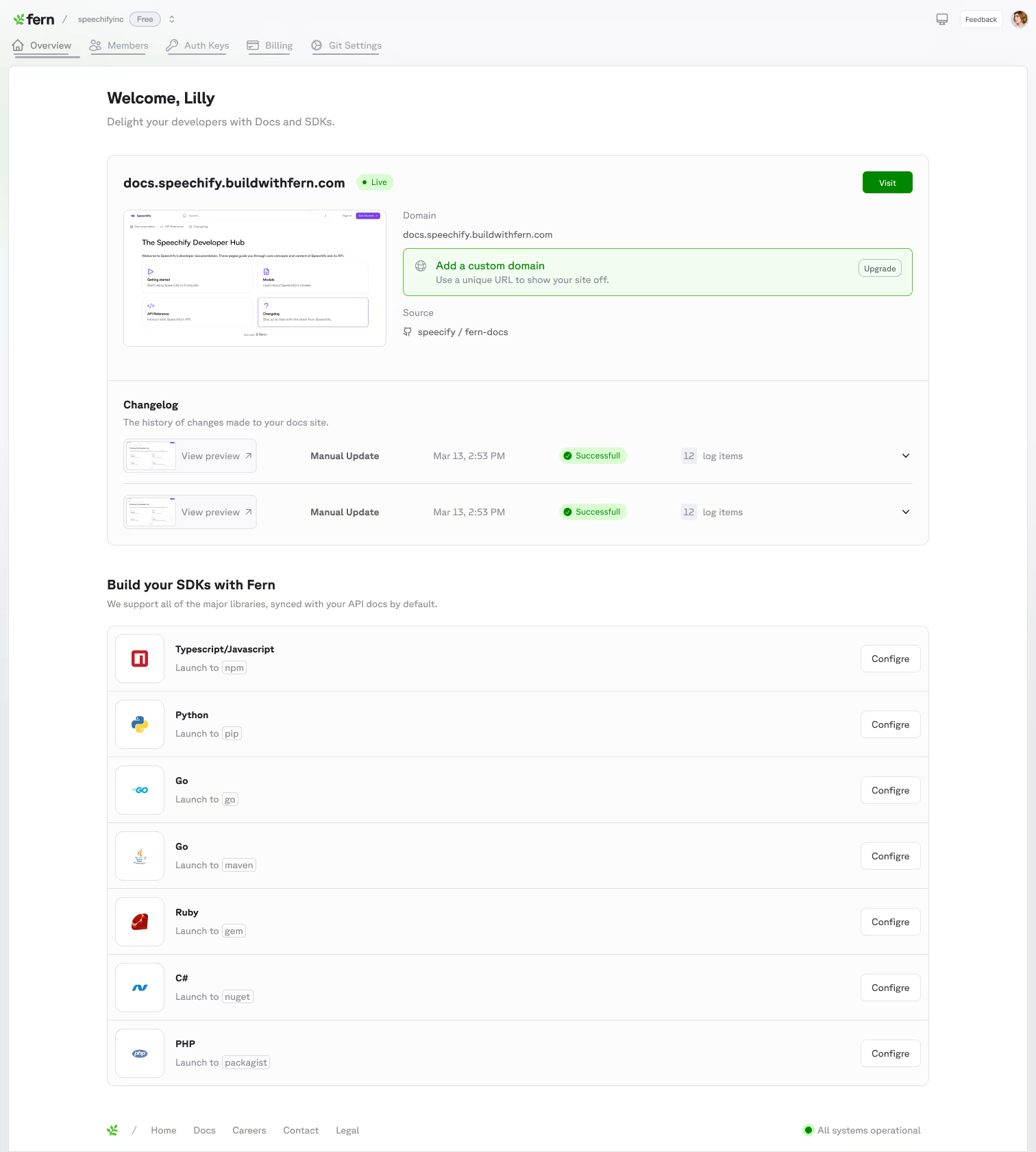
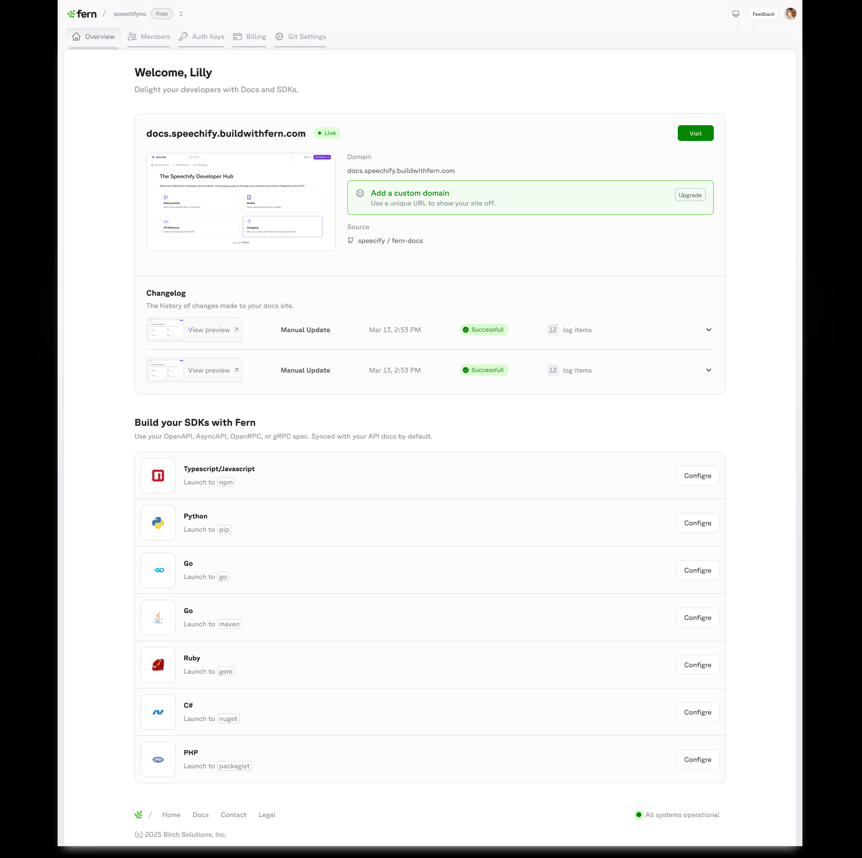
Everything else stayed in the CLI until it earned enough commotion from a customer to warrant a Dashboard buildout. That discipline is why the dashboard launched in two months instead of six. Since launch, 373 docs sites have gone live on custom domains and customers have connected 1,500+ GitHub repos, the two workflows that used to be support tickets.
Now our Dashboard supports almost all of our flows including our visual [Fern Editor](link to blog).
What I got wrong
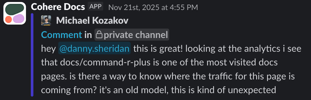
I didn't forsee the amount of data that our customers wanted out of our platform. The dashboard put usage numbers in front of customers for the first time, docs traffic, top pages, AI query analytics, and within hours of seeing them, customers asked how to get them out. Alasdair Brown at ClickHouse:
And is this data available as an API for export? It would be cool if we could do some kind of daily export into our DWH
He was right, and he was not alone. Teams wanted the raw numbers as context for their own analysis and, increasingly, for their agents. We fast followed with export through the CLI, but the lesson stuck: in developer tools, every surface you build will eventually be asked to feed a machine. Design the export path with the feature, not after it.
By the numbers
- 355,000+
- actions by 11,700+ unique users, all time
- 6x
- monthly active user growth, 538 in January to 3,416 in April
- 10,800+
- docs sites created by 5,100+ people
- First commit in March 2025; the MVP shell shipped in about two months and it launched publicly in November 2025
- 375,000+ docs publishes recorded all time, 118,900+ of them in June alone
- 3,700+ API specs added through the onboarding flow in the last month
- 527 paid plan upgrades completed inside the dashboard
- The docs tab is the most used surface, with 23,500+ views in the last 30 days. Aleks at Sayari called the analytics "like vercel analytics but better."
User counts are unique identities, a conservative lower bound.
Launch day
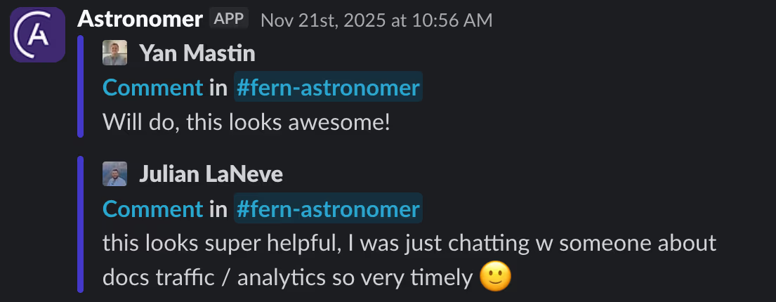
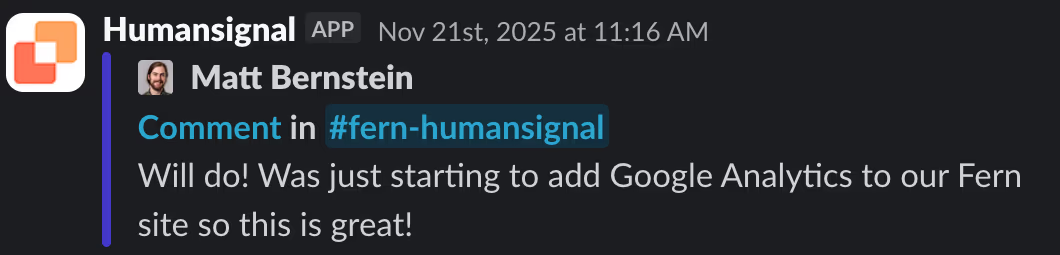
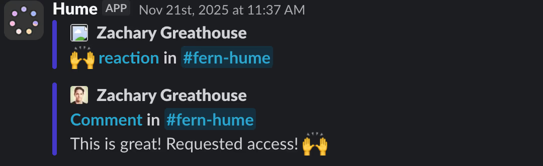
We formally launched the dashboard in our shared customer Slack channels on November 21st, 2025. Some favorite reactions, straight from the threads:

Try it
The dashboard is live at dashboard.buildwithfern.com.
Timeline
Two and a half years of shipping, month by month. The filled dots link to the section where I go deeper.
2025
- MarchDashboard is born: initial skeleton, Vercel preview deploys, and an Auth0 login page.
- AprilFoundations: members page, org roles, PostHog + Pylon + Redis, and the Figma-based design system.
- MayA quiet month, planning and no shipped changes.
- JuneSupabase wired in; the Visual Editor begins (Tiptap editing, sidebar, header).
- JulyAsk Fern lands: the fai service is integrated and the first analytics dashboard (histograms and bar charts) ships.
- AugustGoogle sign-in, an "Ask AI" chat button, and the fai v1.0.0 microservice; the Visual Editor matures.
- SeptemberAnalytics frontend plus an internal PostHog SDK; richer Visual Editor components (images, embeds, buttons).
- OctoberAnalytics goes big: web analytics (countries, paths, search), Algolia search analytics, and customer onboarding endpoints.
- NovemberThe docs onboarding wizard: guided repo creation and repo transfer.
- DecemberFTUX V1 launches, the first true first-time-user flow, plus a cross-domain analytics toggle.
2026
- JanuarySelf-serve custom domains from the dashboard (SSO by email domain, Slack alerts), and onboarding polish with URL autogeneration and a preview widget.
- FebruaryA sign-up page with first-time UX; onboarding tuned around real sample specs.
- MarchBusiest month ever: a members DataTable with login metadata, OIDC group mapping, AI-credit Slack alerts, and self-serve site deletion.
- AprilA streaming analytics page and analytics cron; Brandfetch-powered branding auto-applied during onboarding.
- MayThe agentic era: an API Tokens admin page, persisted agent conversations, Fern Writer runs, and superuser agent chat.
- JuneFTUX V2 build-out: iframe live preview, layout/font/button selectors, and password protection and changelog in the publish flow.
- JulyFTUX V2 becomes the default; an AI Usage page for customers, a resizable sidebar, and event-level search analytics.