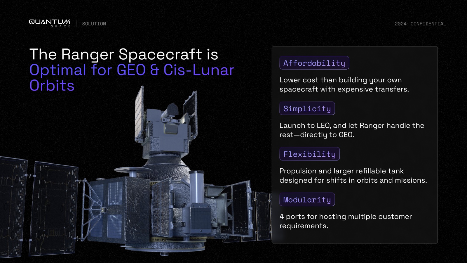
QuantumSpace is building spacecraft for the hard part of the trip — everything past low Earth orbit. Their Ranger vehicle picks up a payload in LEO and carries it the rest of the way out to GEO or the Moon, so a customer never has to buy the expensive ride all the way up. My job was the investor deck: make that road, and the company building it, feel inevitable to people who were sizing up both a defense contract and a venture return.
Letting color do the talking
The whole deck sits on near-black. That part was easy. The decision I actually cared about was giving color a job instead of a mood, so you can feel where you are in the pitch before you read a word.
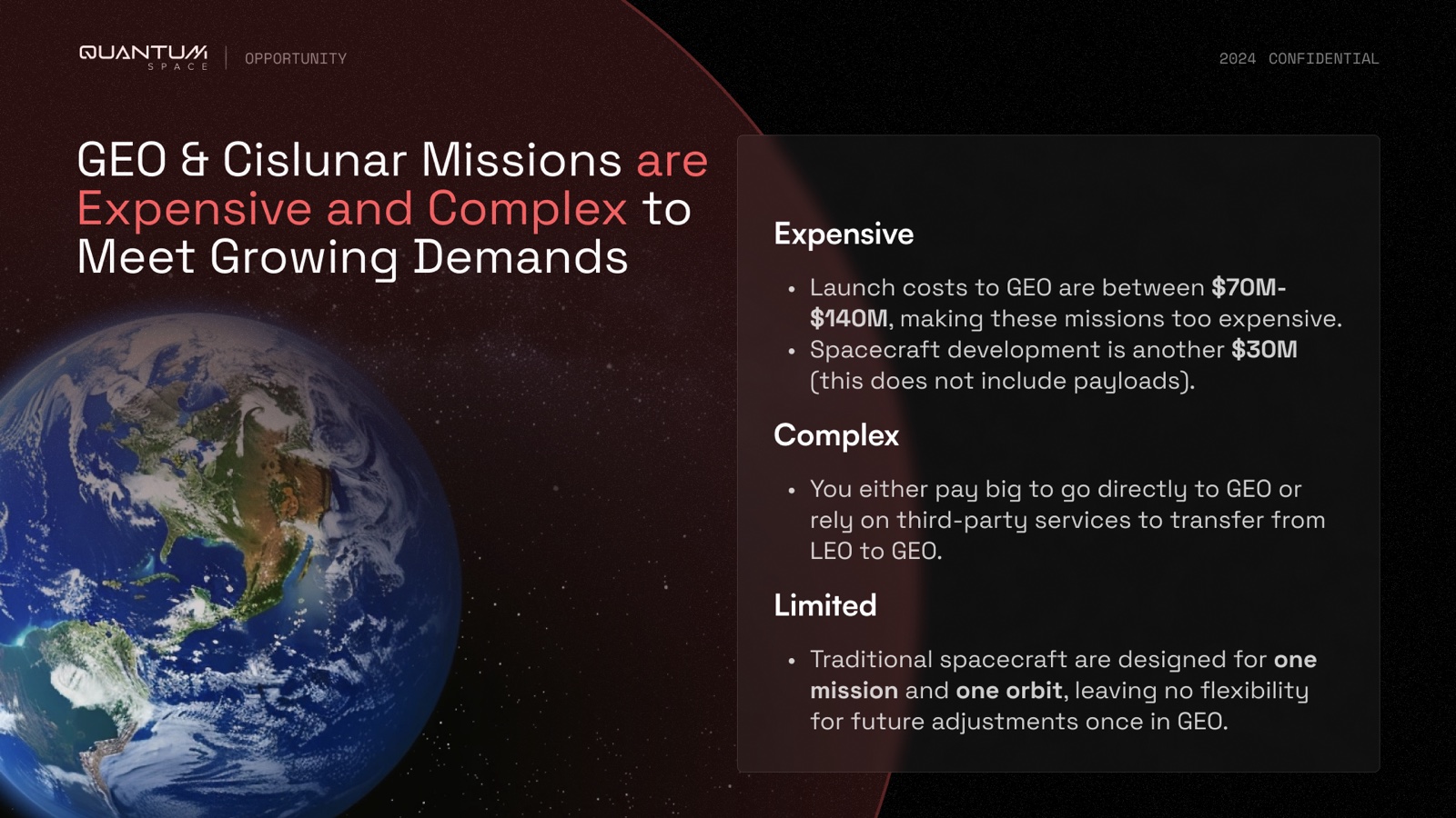
I gave each accent one meaning and stuck to it. Violet is the company — the Ranger, the promises, anything about the product. Green is money — traction, milestones, the raise. And red only ever shows up on the problem, where the whole slide changes temperature so the tension is impossible to miss.
Keeping twelve dense slides calm
A space pitch carries a lot — market math, government contracts, propulsion milestones — and all of it has to stay quiet enough to read. So before I designed slides, I built a small kit and let it do the repeating: a header that always tells you the section, dark rounded cards for every stat and bio, and two layouts I leaned on again and again — a big headline against a column of cards, and simple 2×2 and 3-column grids.
Type does some quiet work too. The headlines are a geometric face with a cut corner on the Q, and everything label-shaped — section names, buttons, spec numbers — is set in a monospace. That mono is the "mission control" voice; it's what makes the deck read as engineered rather than salesy.
My favorite slide
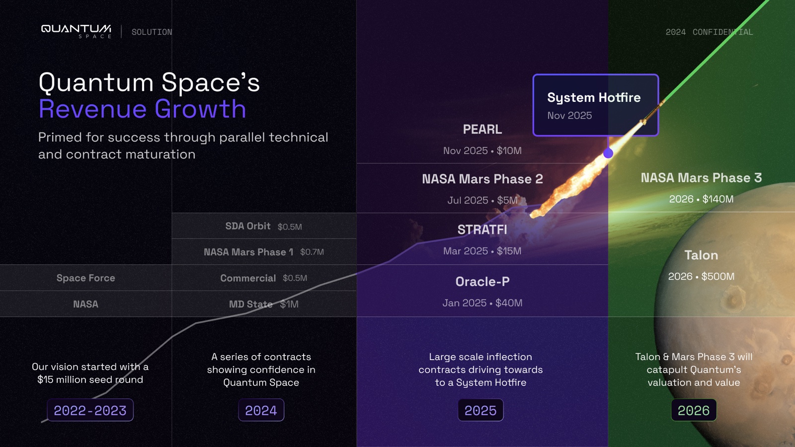
If the deck has a showpiece, it's the revenue slide. I plotted the contracts as a curve of dated, funded milestones and ran it up over a launch plume climbing toward a far-off Mars. The color travels with the numbers — dark space at the bottom, green by the top — so a roadmap reads like a story instead of a table.
Two skins from one system
The deck ships in two versions — dark for presenting in the room, light for the PDF that gets forwarded around afterward — both built from the same components so nothing drifts between them.


Results
The deck became QuantumSpace's front door with investors and partners.
- 12
- slides, in a reusable system
- 2
- themes — dark and light
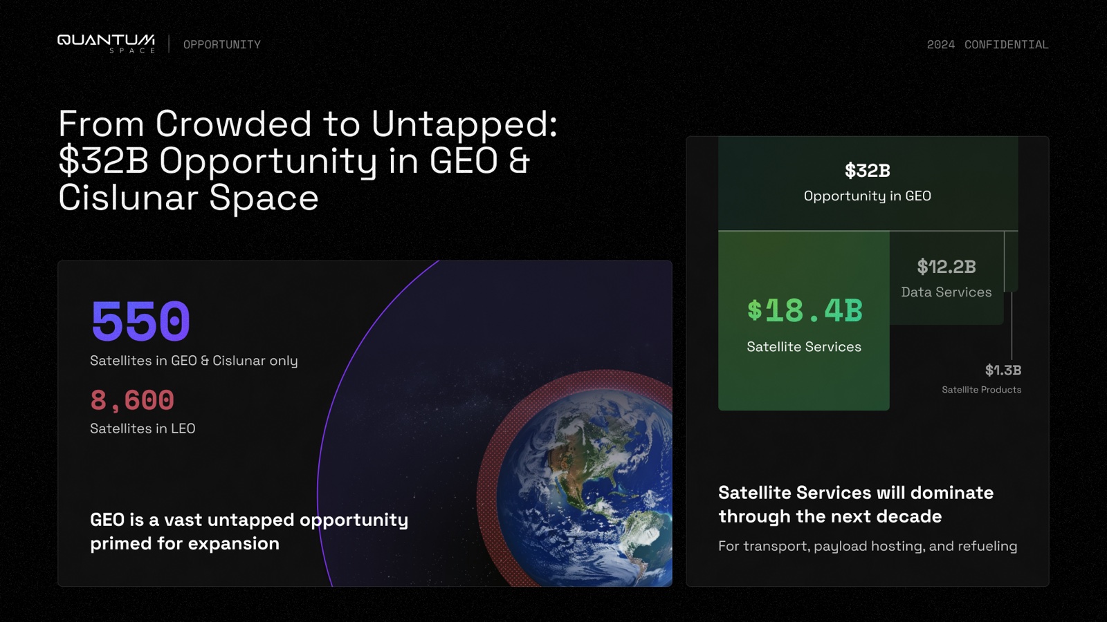
- $32B
- opportunity, made legible
The full deck
 1 / 12