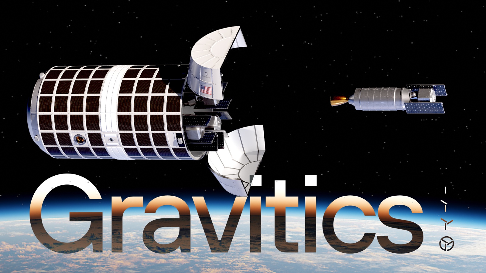
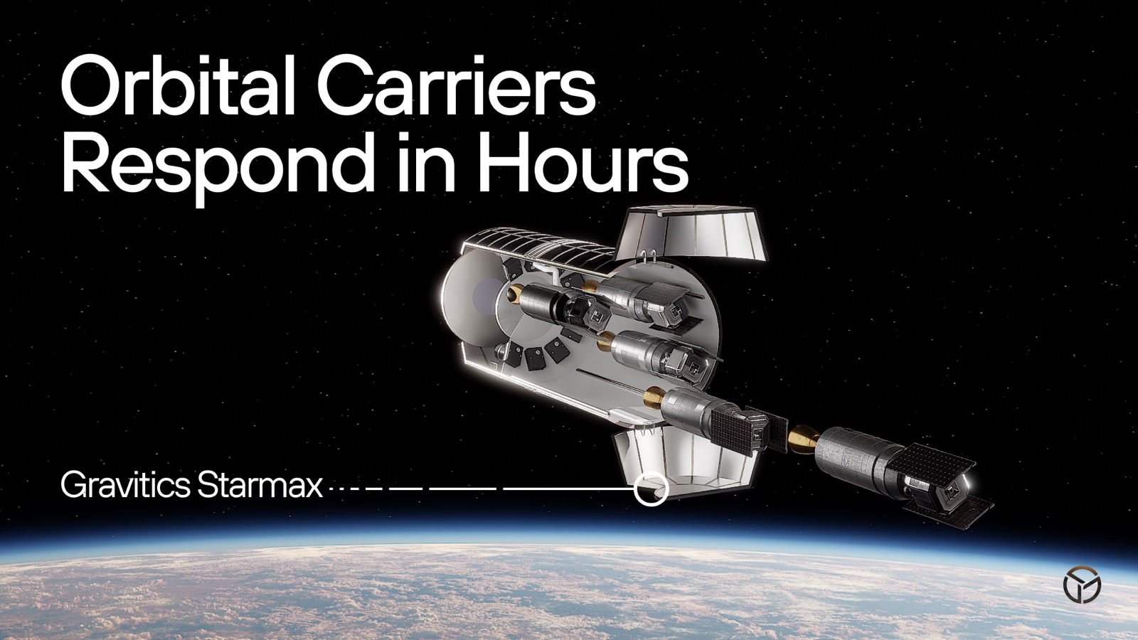
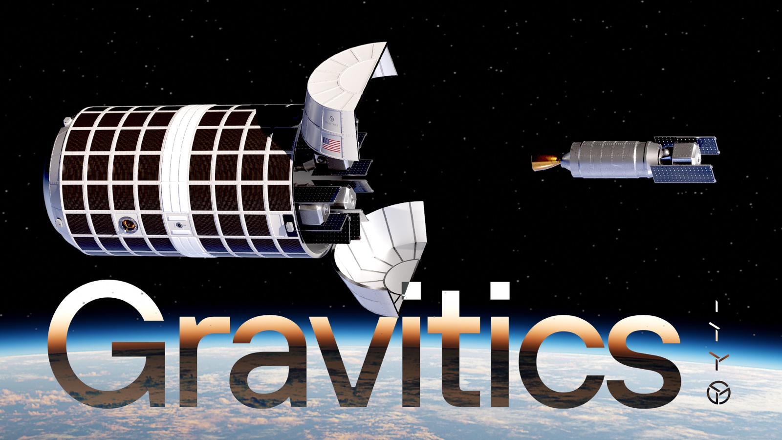
Gravitics builds orbital carriers — big modules that stay in orbit and manage a fleet of small, swappable spacecraft the deck calls "bullets." The entire pitch rides on one image: a revolver in orbit, loaded and ready to answer a threat in hours instead of the weeks a ground launch takes.
A quick, honest note before I dig in: I did deck work for Gravitics, but I couldn't track down my final files. So this is me pulling apart the reference deck the engagement was built around and walking through the system in it — treat the visuals as reference, not as my finished artwork.
Reading the system
The kit is tight, which is what makes it work: a near-black canvas, white type, and one hero accent — a warm metallic gradient that runs orange into gold. That gold is spent almost entirely on two things, money and the word "Gravitics," so every gold moment lands as value. One geometric sans carries the whole ladder, from the giant hero numbers down to the small gray captions.
One image that carries the argument
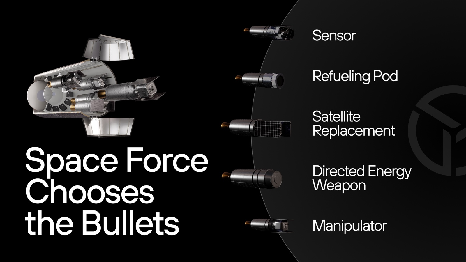
The best slide takes an abstract idea — interchangeable payloads — and makes it a picture you can't unsee: an exploded stack of five rendered "bullets" (a sensor, a refueling pod, a satellite replacement, a directed-energy weapon, a manipulator) floating over a soft curved shadow. Modularity, explained in a single glance.
Selling with restraint
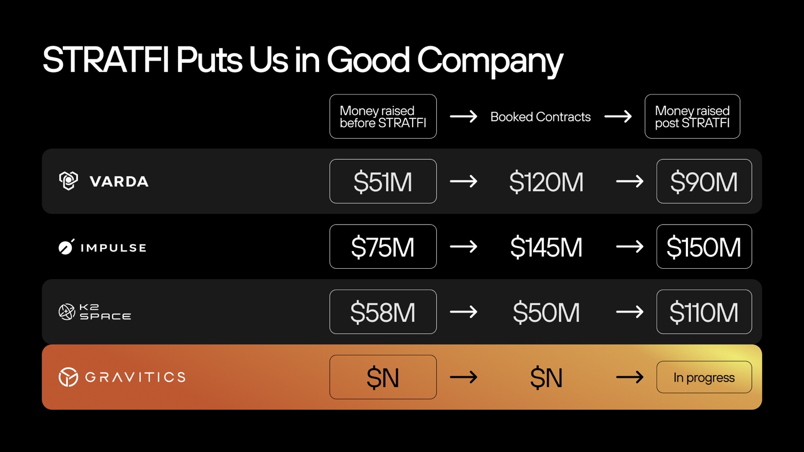
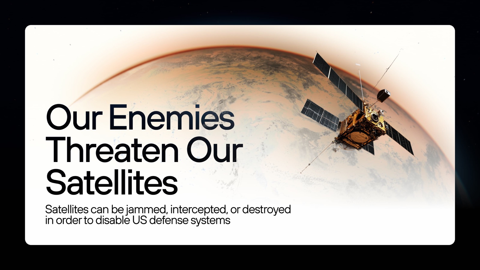
The color discipline is really a storytelling device. Context runs in black and white; gold gets held back for the moments meant to persuade. The comparison table is the clearest example — a plain grid where the one gold row does all the arguing and pulls your eye straight to the booked number. And when the deck needs to grab you, it flips: a single bright slide breaks a run of dark ones to mark the threat.
Size standing in for scale
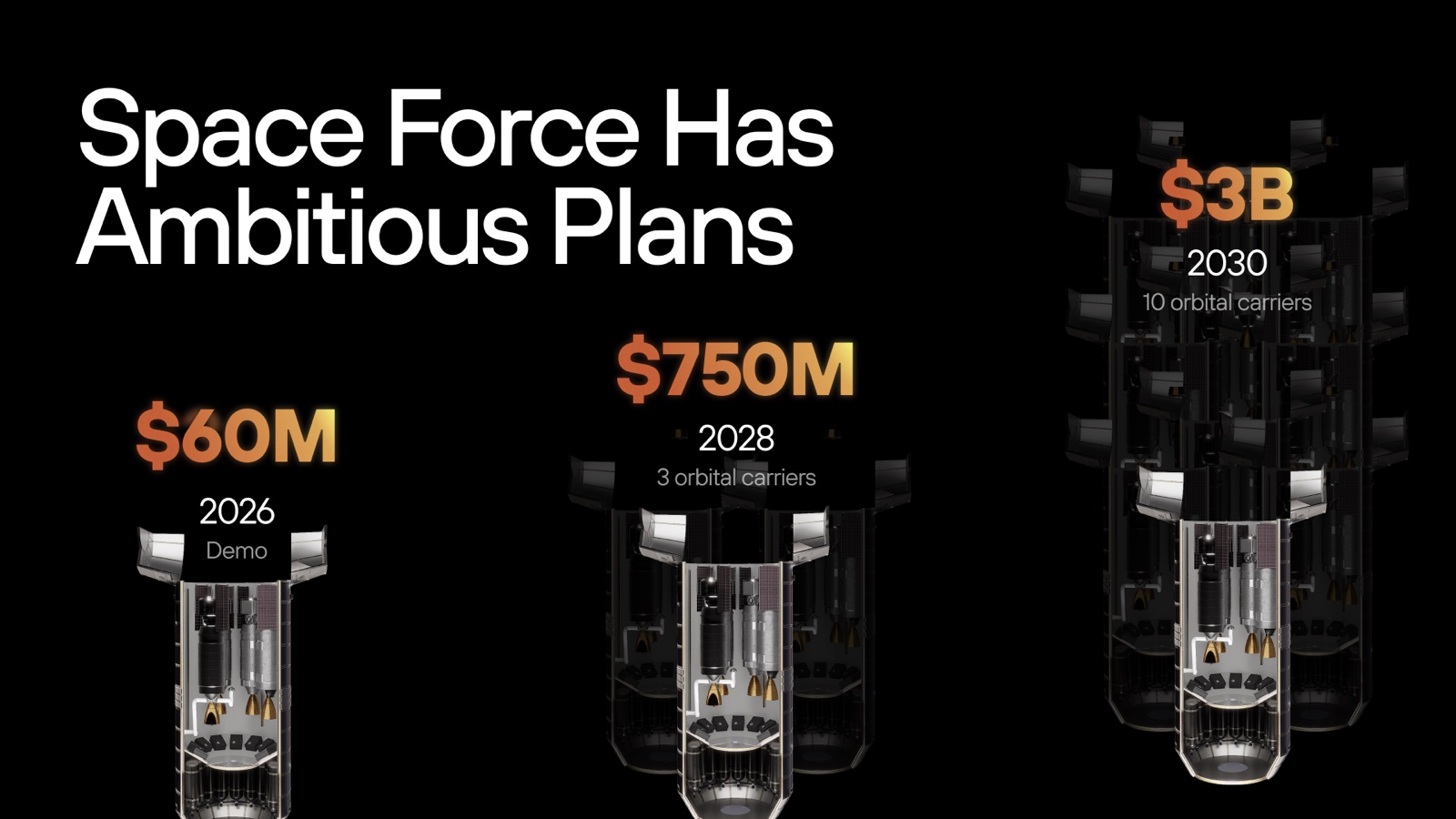
The vision slide encodes money as size: $60M, $750M, and $3B set progressively bigger, with the carrier renders multiplying into a fleet behind them. The layout and the point are the same thing.
Results
Even without the final files, the system holds up — proof that the value was in the thinking, not one irreproducible file.
- 24
- slides in the reference deck
- 1
- metaphor carrying the pitch
- 1
- accent color doing the selling
The full deck
 1 / 24