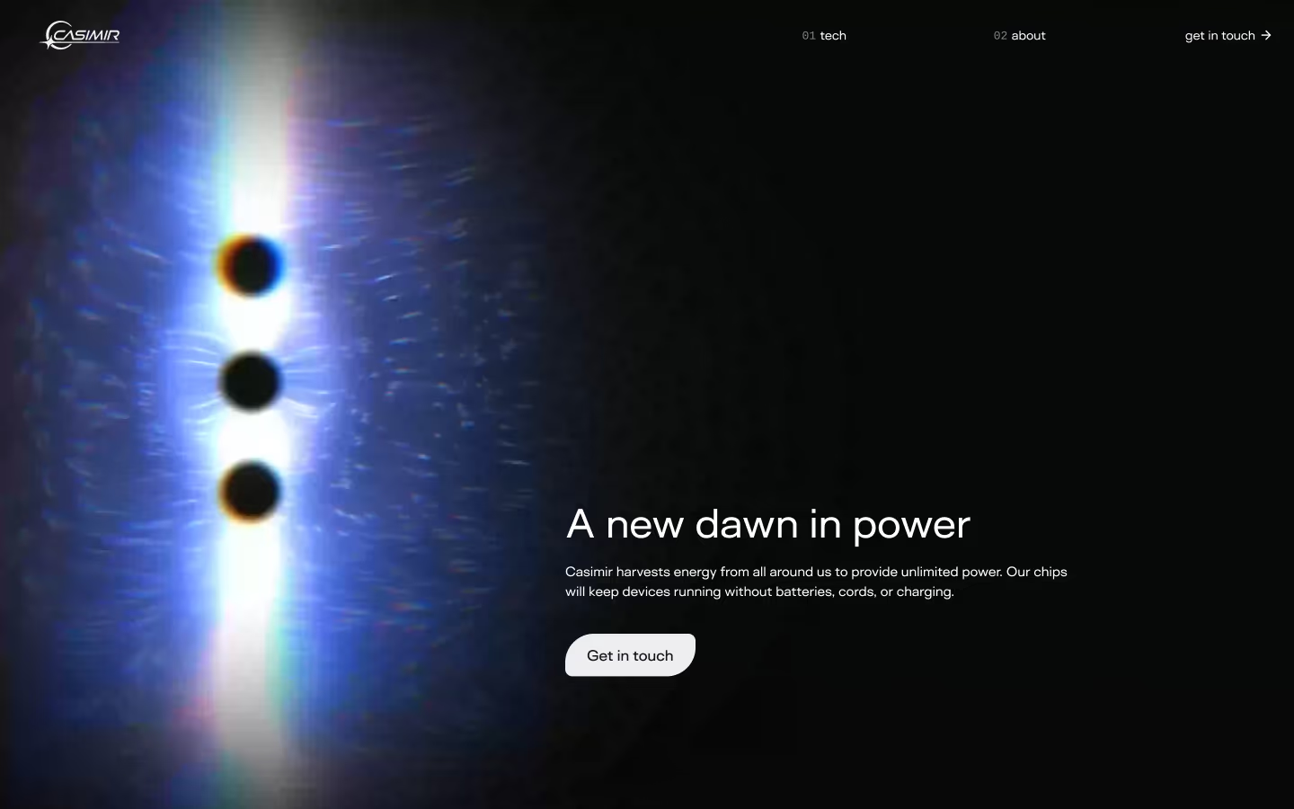
Over six weeks I designed Casimir from scratch — the logo, the brand, and the website — working directly with founder Dr. Harold "Sonny" White, a former NASA propulsion physicist. I designed everything in Figma; Sweven Design built the site in Webflow.
Casimir is a hard company to brand because the pitch sounds impossible: chips that harvest energy from the quantum vacuum, so devices never need a battery, a cord, or a charge. The design had to make that feel credible, not sci-fi.
Making quantum physics approachable
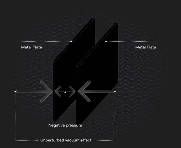
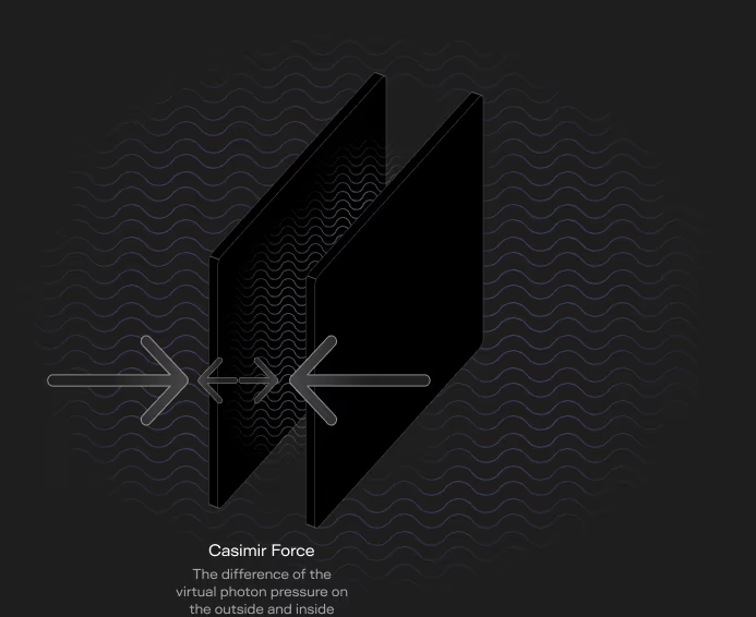
The company is named after the Casimir effect. In 1948, Dutch physicist Hendrik Casimir predicted that two uncharged metal plates, placed close enough together in a vacuum, get pushed toward each other by the vacuum itself — more virtual photons press from the outside than fit between the plates, and the pressure difference squeezes them together. Casimir, Inc. builds microscopic cavities that put that force to work.
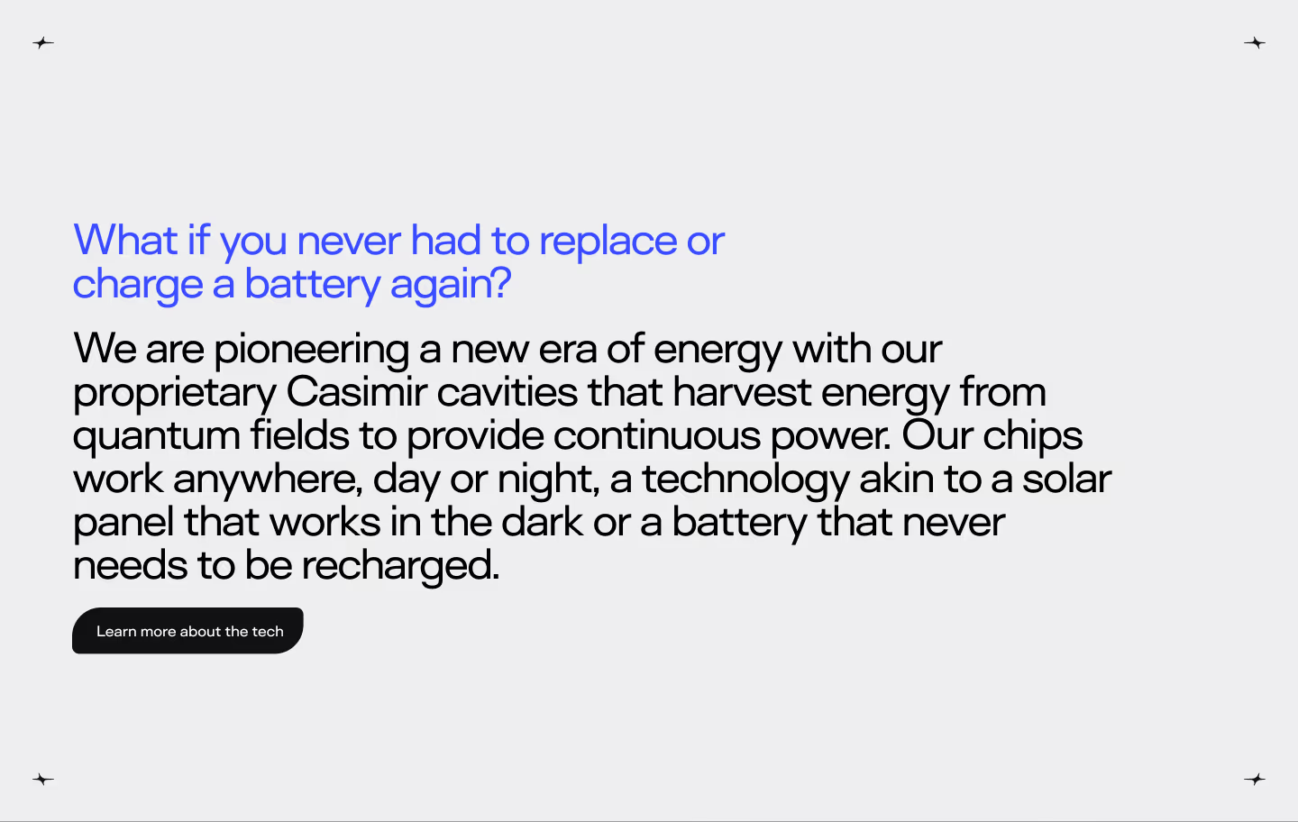
Almost nobody has heard of any of that, and the people who have are skeptical by default. So the storytelling rule I set was: lead with the feeling, then earn the physics. The site opens with a question anyone can answer — what if you never had to replace or charge a battery again? — and only then walks you down into plates, cavities, and negative pressure.
The physics itself got the same treatment: quiet, labeled, diagrammatic. No lightning bolts.
The mark: first light
The logo is an eclipse. A crescent of light breaks around a dark disc, with a four-point glint at the moment of contact — the first light of a new dawn in power. It doubles as a C, and the glint became a system element of its own: it marks section corners across the site the way stars mark a night sky.

The wordmark leans forward in an expanded italic, with the horizon line extending off the R — motion without a swoosh cliché.

The system
Two typefaces carry the brand: Surt Expanded, a wide grotesque that reads engineered and slightly aerospace, and Cousine, a mono for the numbers — nav indices, spec tables, terminology. The palette is honest about the subject: near-black canvases, a prismatic beam of spectrum light, and one electric blue for emphasis. Waves of the quantum field run under everything as a texture.
The middle of the process had an AI lane, too: a scrapyard of Midjourney studies — purple-dot stencils, light and lens experiments — that never shipped, but taught us what the light should feel like before I committed to the final hero artwork.
The website
The site is one narrative arc: dawn → question → physics → product → scale. The hero holds the promise, then each section earns a little more belief.
The product is the Microsparc, Casimir's first chip:
- 5×5mm
- chip footprint
- 1.5V
- continuous output
- 25µA
- of current, day or night
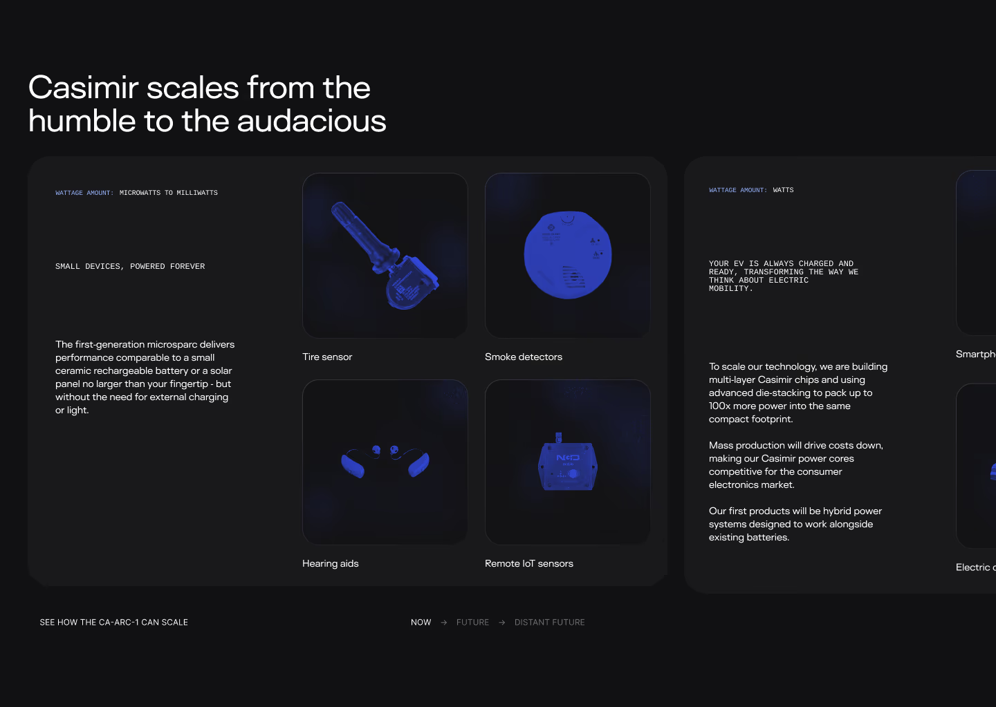
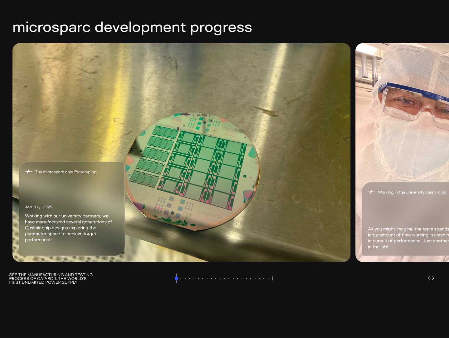
From there the story scales "from the humble to the audacious" — tire sensors, smoke detectors, and hearing aids today; phones and homes on the horizon — and lands on real photos of wafers and cleanrooms, because nothing says credible like manufacturing.
I handed the Figma off to Darren at Sweven Design, who built the site in Webflow — then we worked closely to optimize the load times, tuning asset weight and load order until the glow-heavy pages felt instant.
The site is live at casimir.inc. Go ask yourself what you'd do with unlimited power.