
Axiom Space wants to build the plumbing of an "astronaut economy" — commercial space stations, next-generation suits, and labs in orbit. That's a lot to ask a room to believe. The deck's job was to make something that sounds like science fiction feel inevitable and engineered, credible to a NASA program office and a VC on the same slide.
A cold room with one warm light
I built everything on a deep, desaturated navy — more "deep space" than flat black — and then rationed a single bright orange. Orange only lands on what matters: the active word in the business model, the numbers that count, the little ticks running down the side. That restraint is the whole trick. Because it shows up so rarely, every orange moment reads as important. A quiet steel-blue handles the second tier so the white headlines never have to fight it.
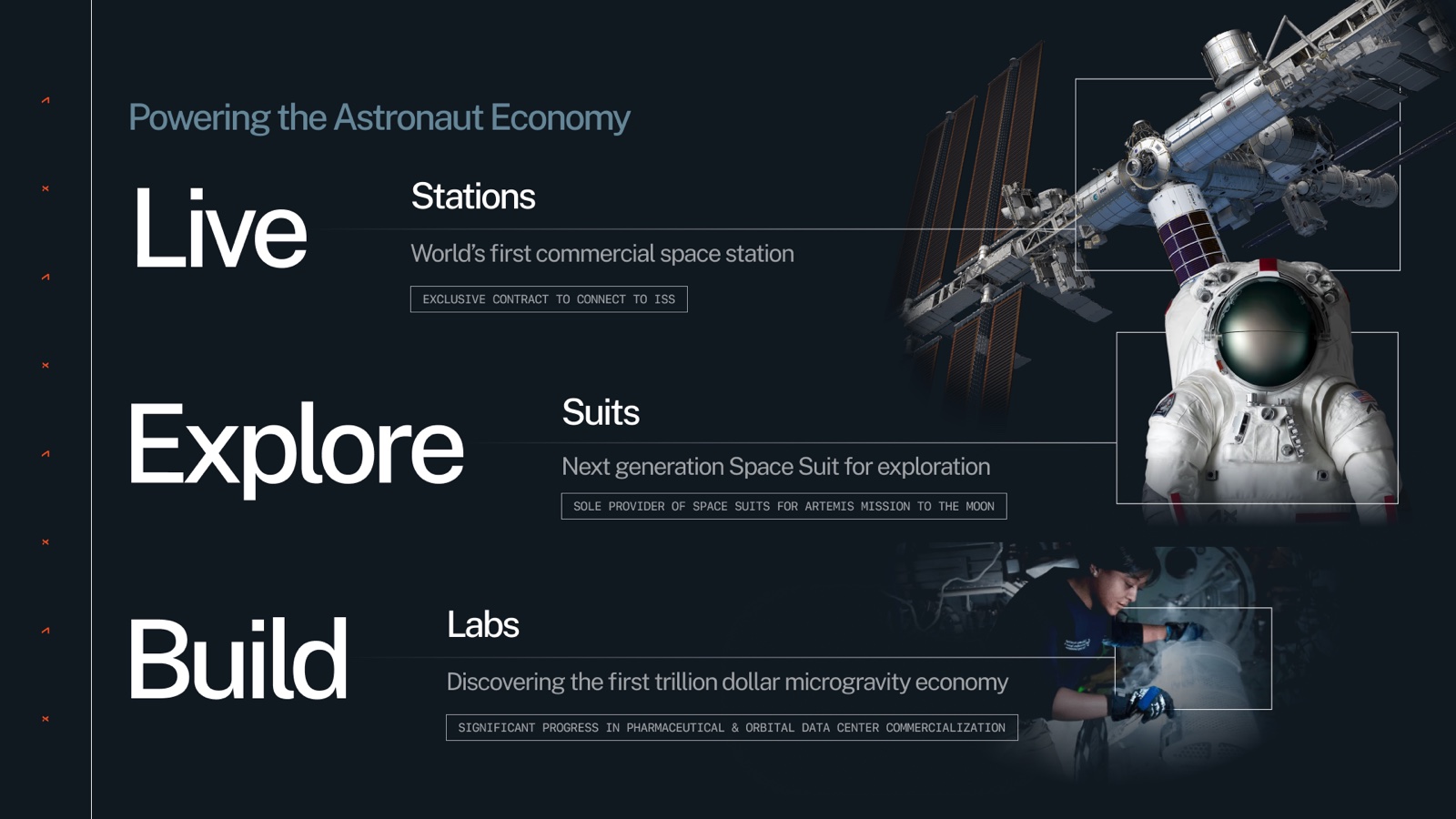
A telemetry layer I could reuse everywhere
The piece I'm happiest with is the annotation system — the little monospace tags (ARCHIVAL FOOTAGE, TECHNOLOGY, CUSTOMER), the thin leader lines, the hairline frames around images. It earns its keep: it separates data from story, it borrows the credibility of a blueprint, and it quietly ties together imagery that has no business sitting next to each other — grainy archival footage, studio suit shots, 3D renders, press photos — under one set of rules.
That grammar is what let the deck cover three whole product lines across two dozen slides without wearing you out. A full-height hairline rail with orange ticks runs down the side like a launch gantry, and everything else hangs off a flush-left grid of 1px lines.
Live, Explore, Build
The three-word thesis — stations to live, suits to explore, labs to build — doubles as the navigation. I introduce it once, then reuse it as a wayfinder on each deep-dive, lighting the pillar you're in and dimming the other two. You never lose your place.
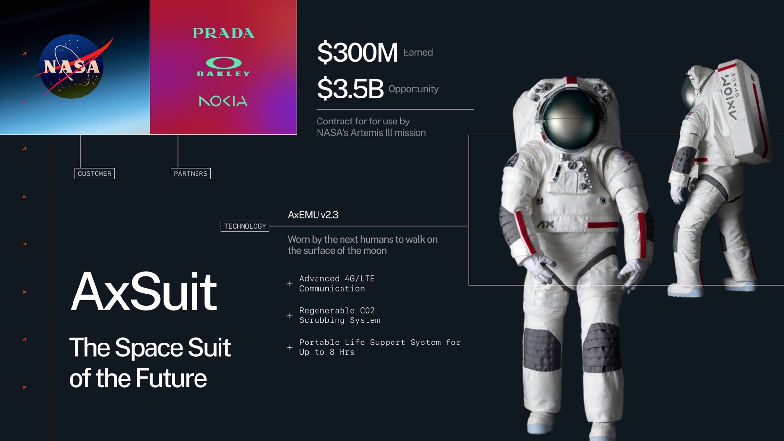
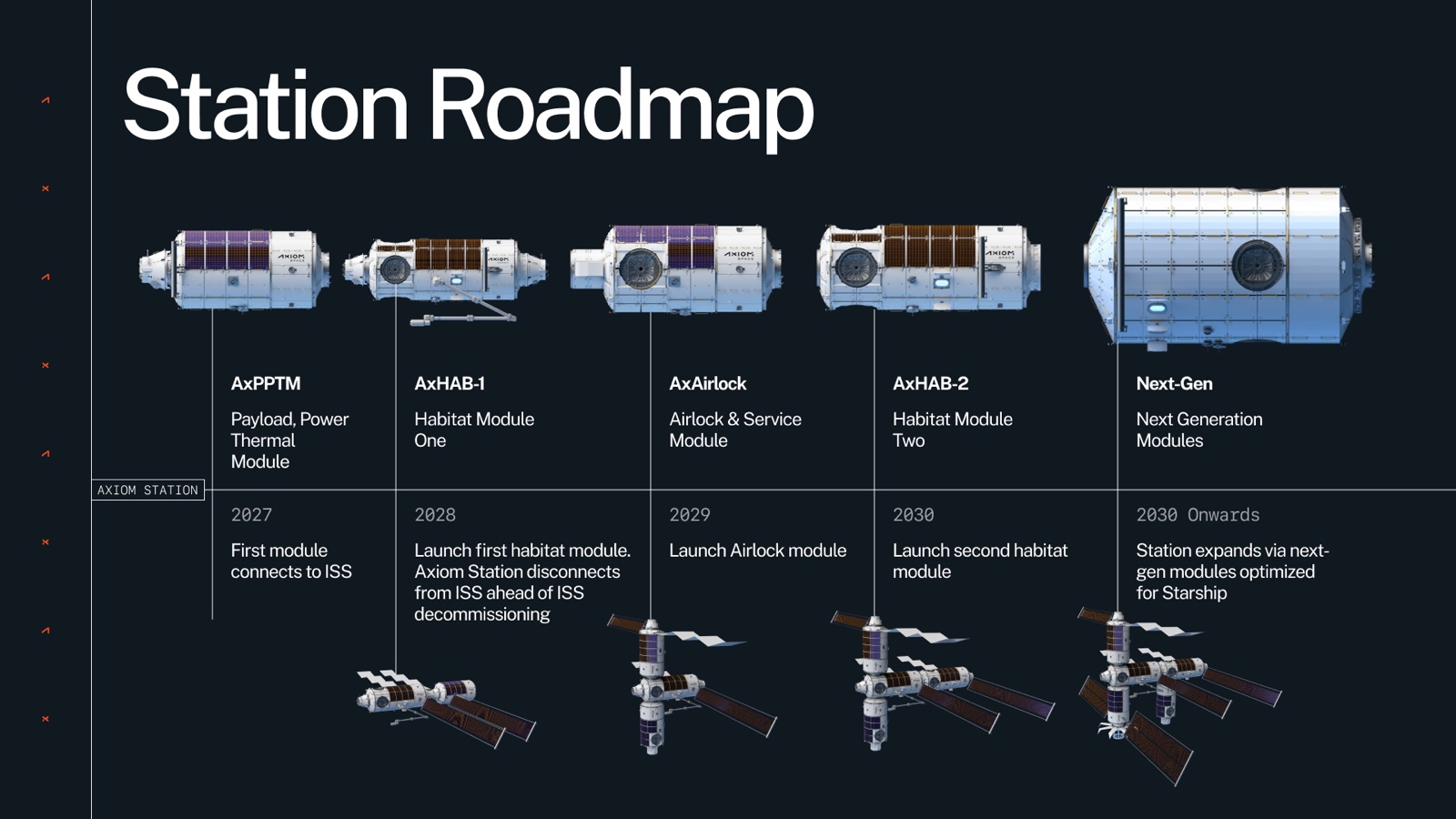
Making the charts feel like the rest of it
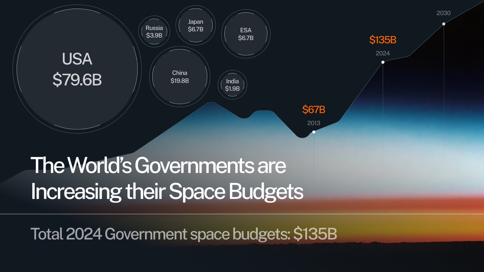
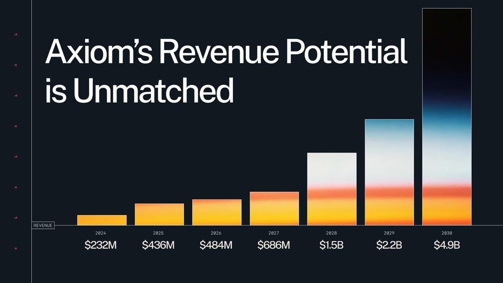
The two data slides share a trick: the same atmospheric-sunrise gradient shows up once as a rising line of national space budgets and once as the fill inside the revenue bars. A hockey-stick chart gets to feel like part of the brand instead of a spreadsheet someone pasted in.
Results
The deck carried Axiom's story across three businesses without ever feeling like three different decks.
- 24
- slides, one visual system
- 3
- product lines: stations, suits, labs
- 1
- accent color, used with discipline
The full deck
 1 / 24